Fall Winter Colors
You know the feeling of spotting swim suits on the racks in February or worse school supplies in July? Well, predicting color palettes in the world of design is the same!
With spring just ahead of us, some brands are already anticipating next fall and winter. While most companies don’t need to plan a year in advance, but starting now for your fall & winter releases will give you plenty of time to design and develop your merchandise.
This dark blue doesn’t culminate feelings of summer, until imagined in the paradise of Greece. This deep color is more representative of a cool crisp sea blue, that is refreshing even in winter.
Illuminating yellow is one of this years Pantone Colors of the year for 2021. Representing the light at the end of tunnel as we approach a full year since the pandemic began with much hope as the vaccine is rolling out.
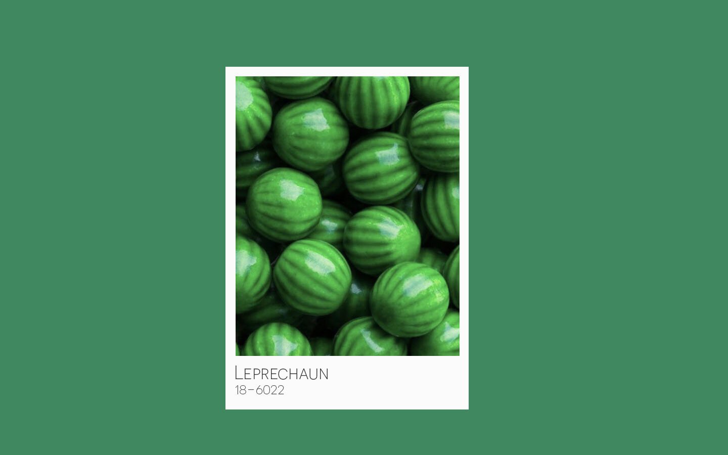
Nearly like a watermelon green, Leprechaun green has an imaginative effect. The name places this green in a fitting Irish setting while also representing the lush side of nature.
Most definitely making for a statement piece, whether in fashion or at home, Fuchsia is a brilliant bold pink. The shade was seen recently on actress Zendaya in a Louis Vuitton advertisement.
As a sweet, gentle pink, Pale Rose is reminiscent of darling baby girl clothes or baby shower parties. But this soft pink has also been seen adding a feminine feel to adult clothing and many home items.
Terra cotta has become popular in just about everything. This orange brown has been all the rage in sheets, bed linens, decor and even fashion. Usually reserved specifically for fall, this shade is sticking around.
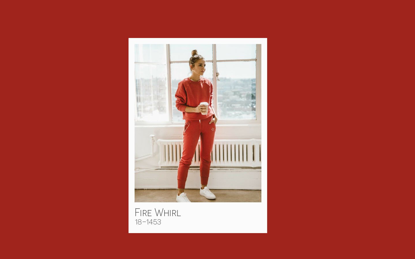
Similar in style to Adobe, this Fire Whirl red is reminiscent of earthly dessert landscapes. Adding flare to any style or look this color will bring in warmth and pop to any palette.
Shades like this are commonly know as royal blue for a reason, being thought to represent high achievement. On the second take differentiating it from black, this is really a deep purple blue. While it’s dark there is a calm to this shade.
Softer than Mykonos, Spring Lake blue is a calming mid-tone. Well suited for the winter months this shade is not bright sky blue or radiant ocean blue, but is rather more muted.
Earthy neutral tones have become more and more popular as boho styles in interior design and fashion have been inspired from western or festival-like culture. Browns have been gaining respect since the 90’s according to Pantone, as Starbucks popped up on every corner with cozy, all brown interiors.
What does this mean for your merchandise? Simply - inspiration! Color schemes come and go while a few are staples. You know your customers and we simply hope to inspire some creativity when planning your next project.


